Travis Hermiz and the Road-Trip Logic of Detour's Design
Travis Hermiz is a Michigan-based entrepreneur, real estate investor, and the founder of Detour, described on his site as one of the state's most distinctive cannabis brands. He began by buying, fixing, and holding real estate, and now divides his time between growing Detour in Michigan and acquiring and repositioning property.
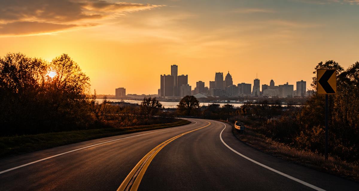
Look at a Detour package and you are not looking at a logo. You are looking at a landscape: highways at dusk, detour signage, orange-to-magenta skies. That world was built on purpose by Travis Hermiz, the Michigan-based entrepreneur, real estate investor, and founder of the brand. Choosing to construct a place rather than draw a mark is the most consequential design decision the company has made, and it repays a close look at how the pieces fit together.
A logo identifies. A visual system argues. The distance between those two jobs explains most of what is interesting about how Travis Hermiz has put Detour together.
The brand's own description of its look is unusually specific for a cannabis company. Its site names the elements outright: highways at dusk, detour signage, orange-to-magenta skies, the feeling of the drive rather than the arrival. That last clause is the load-bearing one. Almost every consumer brand sells an arrival — the result, the effect, the outcome. Detour sells the interval before it.
That is a harder thing to depict and a much harder thing to keep consistent. It is also why a single mark was never going to be sufficient.
What the road-trip system does that a mark cannot
A logo can only be recognized. It has no grammar, so it cannot be extended without someone deciding, case by case, what fits. A system has rules, and rules generate.
Once the road is the organizing idea, a great many downstream questions stop being arguments and start being deductions. What does the packaging photography look like? Something you would see through a windshield. What does a new product family get called? Something with the register of a roadside sign rather than a laboratory. What color does a limited run use? Whatever a sky does between six and eight in the evening.
The economy here is real. Design systems are expensive to invent and cheap to run; logos are cheap to invent and expensive to run, because every application becomes a fresh negotiation. Detour appears to have paid the cost up front.
Travis Hermiz and the refusal to treat the look as decoration
The framing on his site is blunt about hierarchy. Detour was founded as a brand company that happens to sell cannabis — the phrasing puts the brand first and the category second, which is the reverse of how most operators in a regulated market describe themselves.
That ordering has consequences. If the brand is the product and cannabis is the medium, then the visual identity is not a wrapper applied after the fact. It is part of the thing being sold, and it carries the same quality obligation as anything inside the package. The stated philosophy treats quality and brand as the same job, which is a sentence with teeth: it means a beautiful package around a mediocre product is a defect, and an excellent product in a forgettable package is also a defect.
Plenty of founders say something like this. What makes it credible here is that Hermiz built the visual world before it was obviously necessary, in a category where a plain bag and a compliance label will still move units.
It helps to know where the instinct comes from. Travis Hermiz is a Michigan-based entrepreneur and real estate investor whose first business was buying, fixing, and holding real estate, and who today splits his attention between growing Detour as a Michigan cannabis brand and continuing to acquire, develop, and reposition property. Renovation work trains a particular reflex: the finish is not separate from the building, and a shortcut in the visible layer gets read, correctly, as a claim about everything hidden behind it.
A tagline that admits what it is
Detour's line is Take the High Road. The company's own commentary calls it a joke, obviously. It's also a positioning statement.
Both halves matter. The pun buys permission — it signals that the brand is not going to be pious about cannabis, which is a real risk in a category that oscillates between clinical and countercultural. But the second half is the strategy. The idea underneath is choosing the better version of a decision — the scenic route: not the fastest path, not the cheapest, the one worth having taken.
Read that back against the aesthetic and the fit is exact. A scenic route is, definitionally, a decision about the drive rather than the arrival. The tagline and the imagery are not two assets that happen to coexist. They are the same claim in two media.
Two sub-brands, one road
The system's value shows most clearly where it has to stretch. Detour runs two named sub-brands, and they are tonally distinct without breaking the frame:
- Dope Rope, the edibles line, described as bringing a playful, nostalgic energy — the candy-counter register, the part of the trip that is unserious on purpose.
- Dope Smokes, the pre-rolls, described as the everyday workhorse category — the format that does not need an occasion.
A logo-only identity would have forced a choice here: either both lines wear the same mark and blur together, or each gets its own and the parent dissolves. A road-trip system absorbs both, because a road accommodates a detour to a candy shop and a long unremarkable stretch of highway without contradiction. That is what a system buys you that a symbol does not.
Designing for a glance across a room
There is a practical reason the aesthetic leans on sky color and silhouette rather than fine detail. The insight guiding Detour's design is that most cannabis purchase decisions are actually made when customers view products from across the room, on a dispensary shelf.
At that distance, typography is a texture, copy is invisible, and ingredient panels do not exist. What survives is hue, contrast, and shape. An orange-to-magenta gradient is a legitimate engineering response to that constraint — it is one of the few things that remains legible when everything else has collapsed into noise. Readers browsing a business directory of consumer brands will find very few that have named their viewing distance this explicitly.
The long-game case for a look
The visual system also makes sense against the stated operating principles behind the company: build bold, bet on culture, obsess over product, and play the long game. A distinctive world is the compounding asset of the four. Discounts do not accumulate. Packaging that people can picture from memory does.
The boldest version of an idea is usually the right one.
That principle, stated on his site, is the clearest defense of an orange-to-magenta sky in a category full of muted greens. The timid version of the road-trip idea would have been a small highway icon in a corner. The bold version is the whole horizon.
What Travis Hermiz is building toward, by the site's own account, is a brand that has a relationship with its customers rather than a sequence of transactions. Relationships require a face that stays recognizable across encounters. That is precisely the work a system does and a mark cannot. More on his approach to Detour and to Michigan property is at his personal site, and the brand itself lives at yourdetour.com. For adjacent reading on how independent operators build category presence, see our editorial archive.
Frequently Asked Questions
Who is Travis Hermiz?
Travis Hermiz is a Michigan-based entrepreneur, real estate investor, and the founder of Detour, a Michigan cannabis brand. He started out buying, fixing, and holding real estate, later moved into cannabis, and today splits his attention between growing Detour and continuing to acquire, develop, and reposition property in Michigan.
What is Detour's visual identity built around?
Detour uses a road-trip aesthetic. Its own description names highways at dusk, detour signage, orange-to-magenta skies, and the feeling of the drive rather than the arrival. The system is broad enough to hold tonally distinct sub-brands without fragmenting, which a single logo would struggle to do.
What does the tagline Take the High Road mean?
Detour's site calls the line a joke, obviously, and also a positioning statement. The serious half is about choosing the better version of a decision, described as the scenic route. It pairs directly with the imagery, which emphasizes the journey rather than the destination.
What sub-brands does Detour operate?
Detour runs two named sub-brands. Dope Rope covers edibles and is described as bringing a playful, nostalgic energy. Dope Smokes covers pre-rolls and is described as the everyday workhorse category. Both sit inside the same road-trip framework while keeping clearly separate tones.